


UX Research
Since I believe that everything should be user-centered during the design process, I began to create empathy with existing and potential end-users for Dustin. To empathize and understand the users' pain points, needs, and goals, I did a 1: 1 semi-structured interview with 2 participants. In the interviews, I used open-ended questions to encourage participants to share their opinions and feelings about buying IT goods from the internet. I also did a survey that has been answered by almost 40 participants and the purpose of the survey was to collect both quantitative and qualitative data.
From my UX research, I found which devices users used the most, their shopping patterns, customer journey, end goals, and pain points.
You will find some of the lessons below.


Competitor analysis
Andra delen av min research centrerades kring andra konkurrenter och de två konkurrenter som jag har valt är Komplett och Elgiganten. Konkurrentanalysen hjälpte mig att utvärdera Dustin homes konkurrenter, förstå dem och deras svagheter samt deras design lösningar gällande mega-menyn och varukorgen. Första steget i analysen var att skapa en profil för varje konkurrent som innehöll en generell beskrivning för styrkor och svagheter av konkurrentens design. Efter det tog jag skärmdumpar från konkurrenternas hemsida och jämförde dem med Dustin home. Genom att ställa alla bilder sida vid sida hjälpte det mig att förstå vad som faktiskt skiljer dem åt och vad som kan förbättras i Dustin mega-menyn samt varukorgen. Till slut med hjälp av www.similarweb.com gjorde jag en webbanalys som gav mig insikter och data. Datan var mest centrerad kring antal besökare, enheter, bransch rang och kön / äldrefördelning.

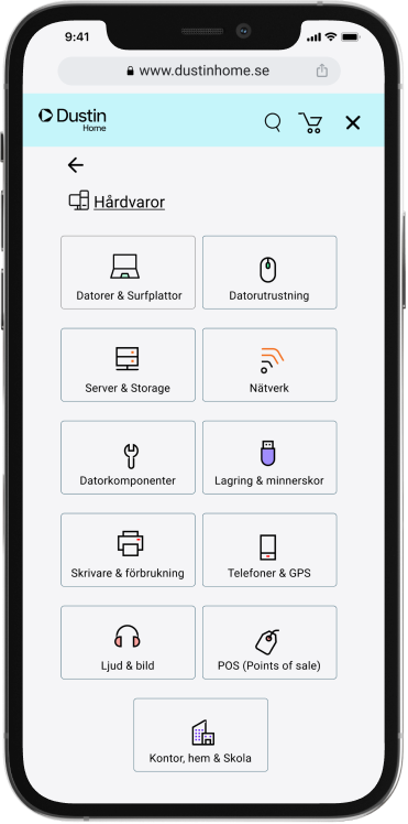
UX review for dustin's current mega menu
To identify usability and interface problems in the Dustin mega-menu, I did a design review and for this review, I used heuristic evaluation tools. Heuristic evaluation tools helped me identify those lawn problems, and write solutions and recommendations as I implemented some of them later in the idea generation and prototype phases. UX review for Dustin's existing solution regarding mega-menu also showed that the navigation process in the mobile version is very long. Users have to go through many unnecessary steps to be able to choose a product category, which affects the customer experience negatively.
Dustin's home existing mega-menu user flow
Interface problems in the search function
As the image below shows, in the search function it says (What are you looking for) and it is an interface problem. According to the Nielsen Norman Group, it is better to have the search function without text because it makes the front-end search function easy to use and easy to find. The reason is that the text disappears when you press the search function and the text makes the search function less visible.


One step closer to user-centric design
Define and analyze
In this phase, it was time to gather all the data and information that I got from my research. For a structured data collection, I have organized and collected the data in three steps as the picture above shows and they are:
1- Data bank for each participant in the interview and the results from the survey.
2- Categories for collected data according to their theme.
3- Priority categories.
These steps helped me gather great ideas to create user-centric solutions, define user problems, and to formulate a problem statement.
Consumers interested in technology need an easier and smoother customer journey to find products because they can not find what they are looking for when they visit the website even if they know what they want to buy.
Finding among the categories that are often messy and unclear is the biggest challenge I face when I use the website's mega-menu
.png)


Organising the data
THE NUMBERS
60%
Already know what they want to buy when they visit an E-commerce website.
57,6%
Can't find the right product.
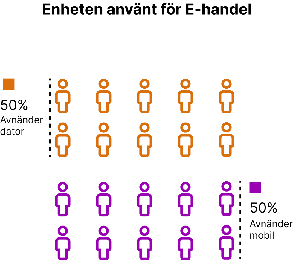
50%
Uses mobile to shop online.
31,4%
Start and end the purchase on the mobile.
28,6%
Starts and completes the purchase on the computer.
40%
Starts on the mobile and ends on the computer.
45,5%
Uses the menu to search for products.
50%
Uses computer to shop online.
Analysing the data
Data analysis showed the majority of users use mobile and laptops to shop online. Their customer journey varies, but the majority start on the mobile and end the purchase on a laptop. Most people search for products via the search box and menu. This leads us to their challenges, 57.6% do not find the product they are looking for even though more than 60% already know what they want to buy. This means searching and finding products during the customer journey (mobile and laptop) influence the user to buy and complete the purchase.
Build empathy with target groups through personas
Creating personas helped to create a certain clarity in the users' needs, behavior, and painting points that become important reference points for building a user-centered solution. I mainly focused on one persona because it represented the main user goals that use or will use Dustin's website. The main user goals are to find the right product quickly and easily.


Creating a balanced solution
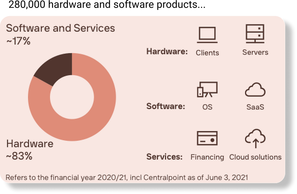
In this phase, It's time to visualize a user-centric experience that is balanced between company goals and user needs. The user needs an easier and smoother way to navigate the website mega menu while the company goal is to improve the customer experience on the mobile and increase B2C customer bases. Today offers Dustin more than 280,000 products, about 83% of the products are hardware and 17% are software. This led me to create many ideas for designing two categories that match customer needs and company goals. In the end, I decided to create two main categories in the mega menu, which are hardware and software. Each category contains sub-categories in the form of icons and text that will help customers quickly navigate and select a sub-category within the mega menu. In addition, to make it faster for the user to buy a product, I created a "buy now" button. The Buy Now button allows the user to go directly to the shopping cart to complete their order without logging in or creating an account.


Formatting the interactions that I expect users will go through to complete their goals using user story map and flowchart.
User Story: As a consumer interested in technology, I want my customer journey on both mobile and computer to be easy, fast and efficient, so I can buy the product that meets my needs.


From an idea to a clickable prototype
From an idea to a clickable prototype
The main purpose of redesigning the mega menu and shopping cart was to make an easy and efficient user journey, from choosing a category to paying. I started the prototype phase by designing the mobile version in Figma and when the mobile version was ready I designed the laptop version. The user wants an easier and smoother way to find and order products, so what changed and what design solution did I implement? Below you can see the before and after.


Clickable prototyp

Please click on the image to open Figma prototype ↗
Please click on the image to open Figma prototype ↗
User testing
I did two qualitative user tests, one for mobile and one for laptop. While the participant completes each task, I observed their behaviour and listened to their feedback. Feedback from the participants was good they think it is easy to use the website's mega menu and shopping cart and all information are well organized. I also received improvements feedback and some of them are:
-
A brief explanation of what hardware and software stand for.
-
Better colour for the B2B website on the mobile because it is too dark.
-
The hardware category on the computer prototype is a bit difficult to navigate.
-
The text in the shopping cart in the mobile prototype is too small.
Observation result:
-
Took a while for participants to find the "back to product category" button on the desktop version.
-
Hard to click the B2C & B2B button on the desktop version.
-
The participants did not notice that an item has been added to the shopping cart on the desktop version.
DUSTIN HOME MEGA MENU UX/UI CASE
8 MIN READ
PROJECT BACKGROUND
This project was part of the UX training implemented by Chas Academy in collaboration with Dustin.
OVERVIEW
Today, Dustin offers approximately 28,000 products and the large product range has led to a mega-menu that affects customers' experience in a negative way. Customers have a hard time finding products that match their needs due to the mega menu on both mobile and desktop. In addition, the experience in the mobile is neglected and it needs to be improved. An improvement in the mega-menu and customer journey to find products on both desktop and mobile was challenging, but this will ensure that Dustin remains competitive in the long term and increase the customer base for the B2C website.
GOAL
The goal is to improve the Dustin Home mega-menu and shopping cart to have a better customer experience. In addition, to help Dustin increase their B2C customer base and optimize their website.
CHALLENGES
To redesign the mega menu to suit the user's needs and the company's goals.
PROBLEM STATMENT
Consumers interested in technology need an easier and smoother customer journey to find products due to the fact that they can not find what they are looking for when they visit the website, even if they know what they want to buy.
ROLE
I led this project alone as UX / UI Designer but I want to take the opportunity to thank everyone who participated in the UX research and user testing phases.
PROJECT LENGTH
4 weeks - February 2022 to March 2022.
TOOL
Figma
What did i learned?
-
Focus on the problem because at the end of the day, it's the users' pain points that Im trying to solve. So it is important to have users' problems in front of me at all times and it is more important not to get distracted and start solving other problems.
-
A pixel perfect UI in MVP will not solve users' problems, UX does.
-
To write effective interview questions and surveys that can collect useful data.
© 2023 Created with lots of 🤍 and ☕️